Mall Customer Segmentation - Machine Learning in R
Max Lang / 2021-03-28
Most recently I stumbled over this interesting dataset of Mall Customers. After some basic visualizations I had the idea of using the Kmeans-Algorithm to cluster the customers. This process is also referred to as customer segmentation. The K-means algorithm involves randomly selecting K initial centroids where K is a user defined number of desired clusters. Each point is then assigned to a closest centroid and the collection of points close to a centroid form a cluster. The centroid gets updated according to the points in the cluster and this process continues until the points stop changing their clusters. You can find the dataset on Kaggle.
What is customer segmentation?
Customer segmentation is the process of dividing a customer base into groups of individuals who share similarities in different ways related to marketing (such as gender, age, interests, and other consumption habits).
The vision of companies deploying customer segmentation is that each customer has different requirements and specific marketing efforts are required to properly address them. Companies aim to obtain a deeper approach to the customers they target. Therefore, their goals must be clear and tailored to the needs of each customer.
In addition, through the collected data, the company can have a deeper understanding of customer preferences and discover the needs of valuable market segments so that they can get the most profit. In this way, they can formulate marketing strategies more effectively and minimize investment risks.
First we read in the dataset. I renamed the columns so they are easier to read. The Annual_Income_dollar_k is in 1000 US Dollars and the Spending_Score’s range is 1 to 100. Afterwards I set the Gendercolumn as a factor, because it is a categorical variable.
# Read in Data
mall_data <- read.csv('/Users/max/Documents/Data Science/Project_Notebooks/Customer Segmentation/Mall_Customers.csv')

# Data Structure and first cleaning
colnames(mall_data) <- c("CustomerID", "Gender", "Age", "Annual_Income_dollar_k", "Spending_Score")
mall_data$Gender <-  factor(mall_data$Gender, levels= c("Male", "Female"))

str(mall_data)
## 'data.frame': 200 obs. of 5 variables:
## $ CustomerID : int 1 2 3 4 5 6 7 8 9 10 ...
## $ Gender : Factor w/ 2 levels "Male","Female": 1 1 2 2 2 2 2 2 1 2 ...
## $ Age : int 19 21 20 23 31 22 35 23 64 30 ...
## $ Annual_Income_dollar_k: int 15 15 16 16 17 17 18 18 19 19 ...
## $ Spending_Score : int 39 81 6 77 40 76 6 94 3 72 ...head(mall_data)## CustomerID Gender Age Annual_Income_dollar_k Spending_Score
## 1 1 Male 19 15 39
## 2 2 Male 21 15 81
## 3 3 Female 20 16 6
## 4 4 Female 23 16 77
## 5 5 Female 31 17 40
## 6 6 Female 22 17 76summary(mall_data)## CustomerID Gender Age Annual_Income_dollar_k
## Min. : 1.00 Male : 88 Min. :18.00 Min. : 15.00
## 1st Qu.: 50.75 Female:112 1st Qu.:28.75 1st Qu.: 41.50
## Median :100.50 Median :36.00 Median : 61.50
## Mean :100.50 Mean :38.85 Mean : 60.56
## 3rd Qu.:150.25 3rd Qu.:49.00 3rd Qu.: 78.00
## Max. :200.00 Max. :70.00 Max. :137.00
## Spending_Score
## Min. : 1.00
## 1st Qu.:34.75
## Median :50.00
## Mean :50.20
## 3rd Qu.:73.00
## Max. :99.00Here I visualized some insights out of the summaries. First of all it is noteworthy that there are slightly more female customers than male customers in the dataset.
# More females than males in the data
ggplot(mall_data, aes(x= Gender))+
  scale_y_continuous(limits= c(0,120), breaks = seq(from= 5, to= 115, by= 10))+
  scale_x_discrete(labels= c("Male", "Female"))+
  ylab("Amount")+
  theme_minimal()+
  geom_bar(fill= c("dodgerblue3", "tomato3"), width = 0.5)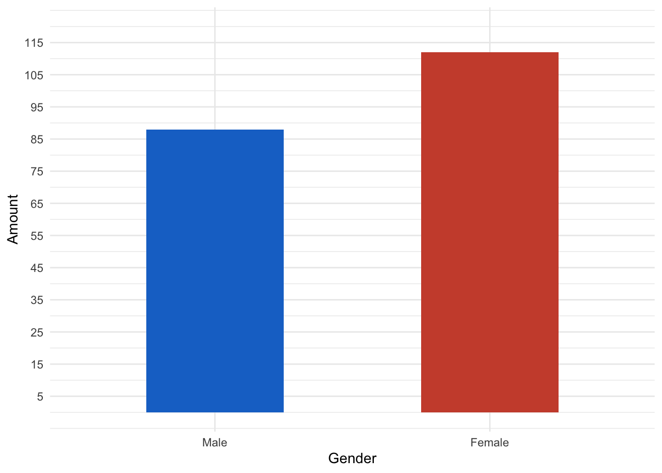
Let’s have a look at the age distribution. We can see that the distribution the distribution is slightly right skewed. We can see that the peak is around 30 years.
# Age distribution
ggplot(mall_data, aes(x= Age))+
  geom_histogram(aes(y= ..density..), alpha= 0.5, position= "identity")+
  geom_density(alpha=.2)
## `stat_bin()` using `bins = 30`. Pick better value with `binwidth`.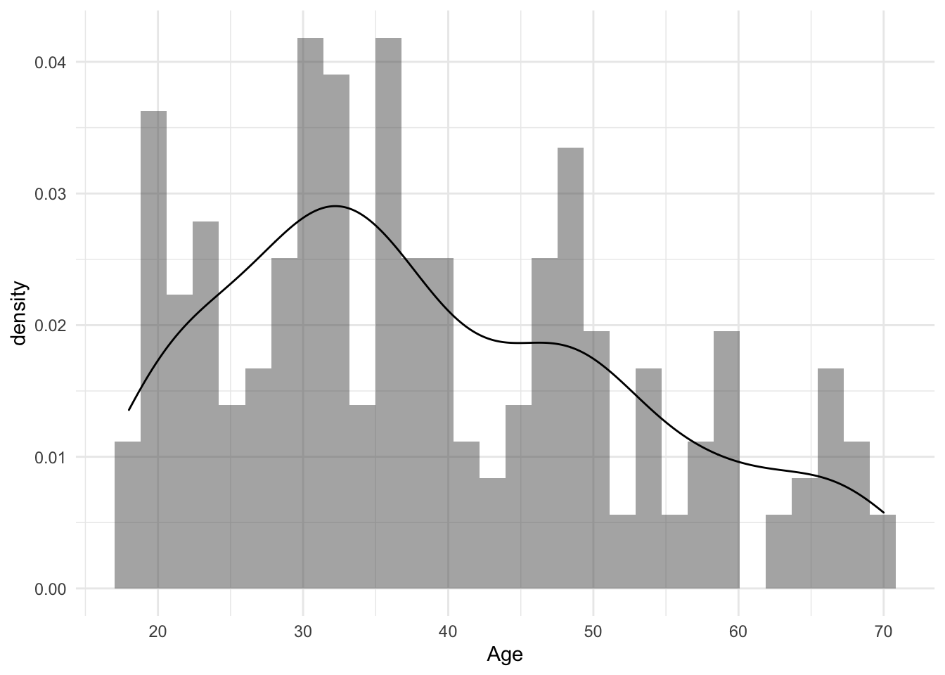
If we take a closer look and facet by sex, we can see that the dataset includes many women around 30. Nothing special so far, both distributions are slightly right-skewed. How,ever we can see that the amount of 20 year old men is significantly high.
# Facetted by Gender
ggplot(mall_data, aes(x= Age, fill= Gender, col= Gender)) +
  geom_histogram(aes(y=..density..), alpha=0.5, position="identity")+
  geom_density(alpha=.2) +
  scale_colour_manual(values= c("dodgerblue3", "tomato3"))+
  scale_fill_manual(values= c("dodgerblue3", "tomato3"))+
  facet_grid(mall_data$Gender)
## `stat_bin()` using `bins = 30`. Pick better value with `binwidth`.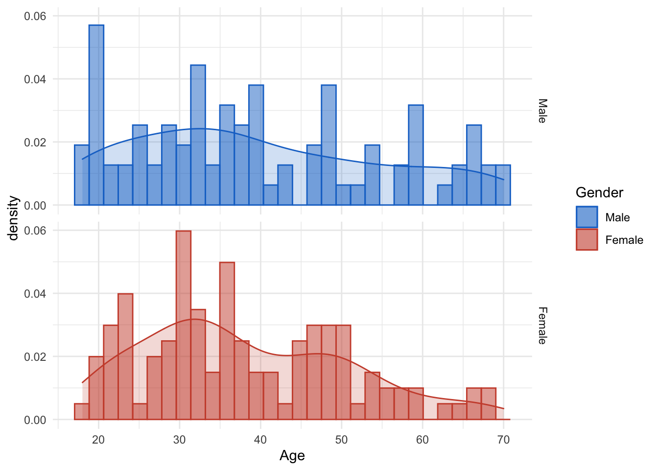
Now to the annual income. Again we look at a slightly right-skewed distribution. The peak is aroun 60.000 US Dollars annual income. Note the outliers on the right end, which is pretty normal for income data. (most of the time.)
# Annual Income
ggplot(mall_data, aes(x= Annual_Income_dollar_k))+
  labs(x= "Annual Income in US Dollar")+
  geom_histogram(aes(y= ..density..), alpha= 0.5, position= "identity")+
  geom_density(alpha=.2)+
  scale_x_continuous(breaks = seq(from= 0, to= 140, by= 10 ))
## `stat_bin()` using `bins = 30`. Pick better value with `binwidth`.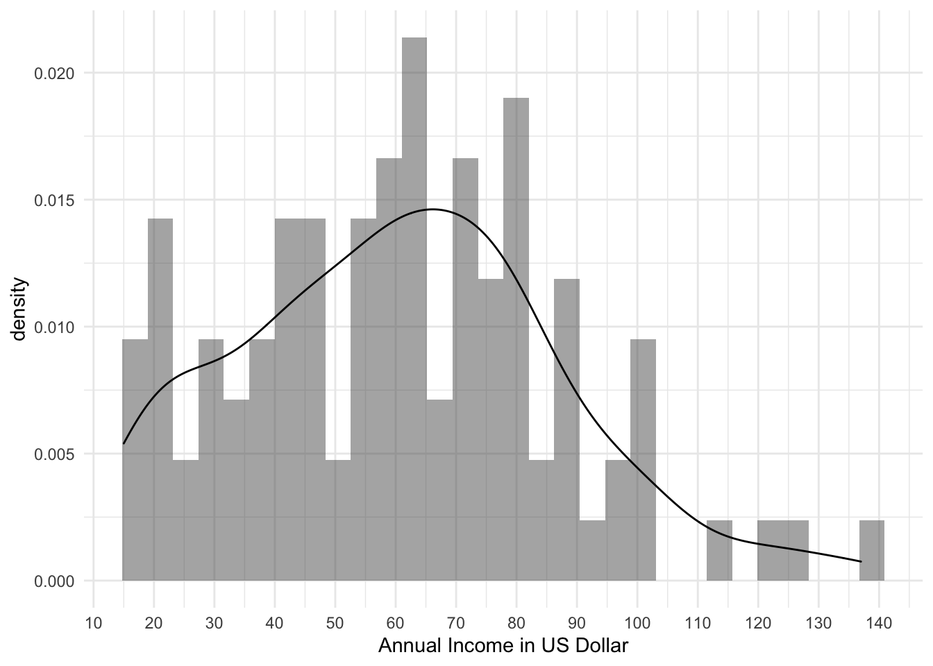 The facetted plot does not give that much more insight. However, one should not that the amount of low-income women is higher than low-income men.
#By Gender
ggplot(mall_data, aes(x= Annual_Income_dollar_k, fill= Gender, col= Gender))+
  labs(x= "Annual Income in 1000 US Dollar")+
  geom_histogram(aes(y= ..density..), alpha= 0.5, position= "identity")+
  geom_density(alpha=.2)+
  scale_x_continuous(breaks = seq(from= 0, to= 140, by= 10 ))+
  scale_colour_manual(values= c("dodgerblue3", "tomato3"))+
  scale_fill_manual(values= c("dodgerblue3", "tomato3"))+
  facet_grid(mall_data$Gender)
## `stat_bin()` using `bins = 30`. Pick better value with `binwidth`.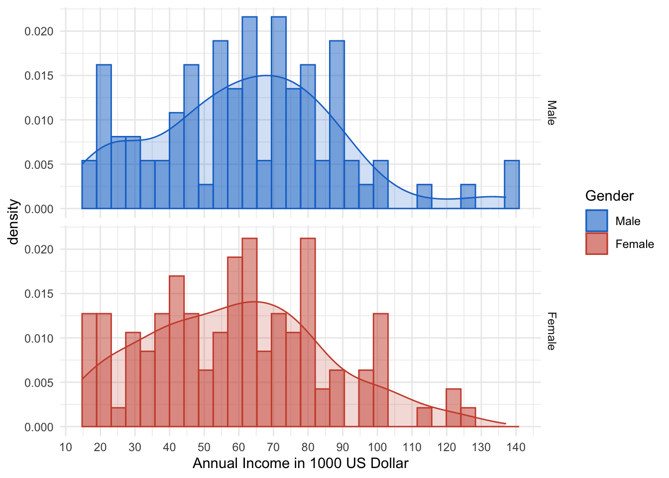
Last but not least we will take a look at the Spending Score. Unfortunately I did not find any further insight on how it is calculated. Nevertheless we cann see that the median is around 50. However, the left/right end also is pretty packed.
# Spending Score
ggplot(mall_data, aes(x= Gender, y= Spending_Score))+
  ylab("Spending Score")+
  stat_boxplot(geom='errorbar')+
  scale_y_continuous(breaks= seq(from= 0, to= 100, by= 10))+
  geom_boxplot()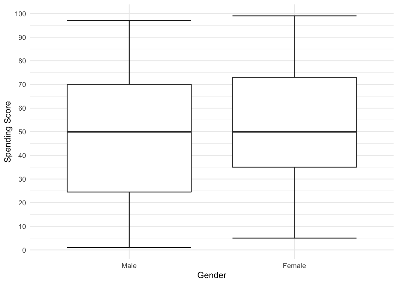
ggplot(mall_data, aes(x= Spending_Score))+
  xlab("Spending Score")+
  geom_histogram(aes(y= ..density..), alpha= 0.5, position= "identity")+
  geom_density(alpha=.2)+
  scale_x_continuous(breaks = seq(from= 0, to= 140, by= 10 ))
## `stat_bin()` using `bins = 30`. Pick better value with `binwidth`.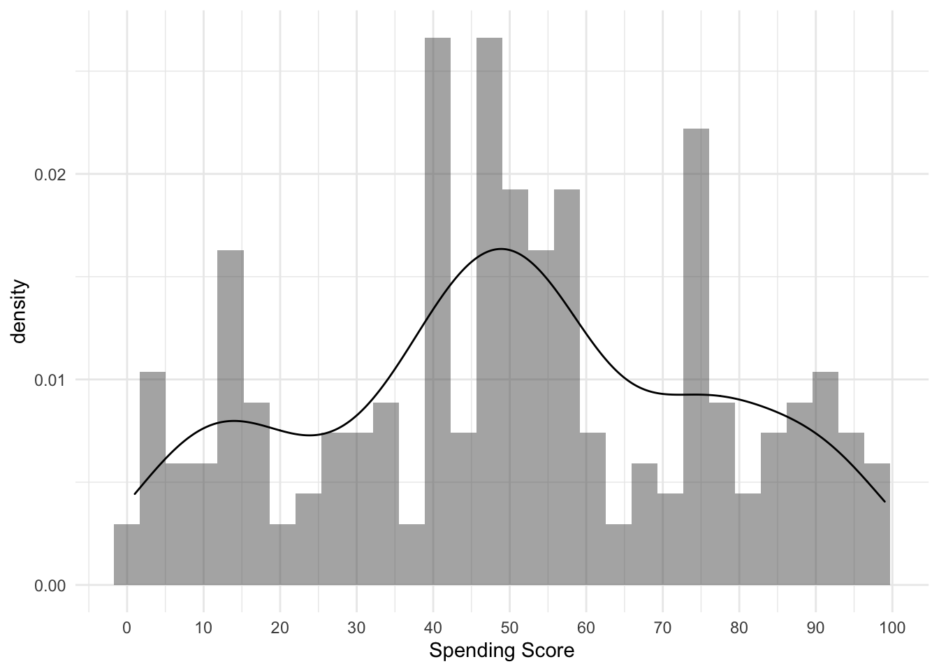
ggplot(mall_data, aes(x= Spending_Score, fill= Gender, colour= Gender))+
  xlab("Spending Score")+
  geom_histogram(aes(y= ..density..), alpha= 0.5, position= "identity")+
  geom_density(alpha=.2)+
  scale_x_continuous(breaks = seq(from= 0, to= 140, by= 10 ))+
  scale_colour_manual(values= c("dodgerblue3", "tomato3"))+
  scale_fill_manual(values= c("dodgerblue3", "tomato3"))+
  facet_grid(mall_data$Gender)
## `stat_bin()` using `bins = 30`. Pick better value with `binwidth`.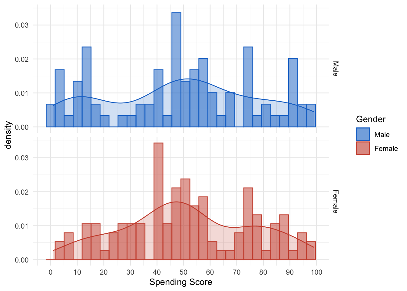
K Means algorithm
When using the k-means clustering algorithm, the first step is to indicate the number of clusters (k) we want to produce in the final output. The algorithm first randomly selects k objects from the data set, and these objects will be the initial centers of our clustering. These selected objects are cluster means, also called centroids. Then, the remaining objects will be assigned the closest centroid. The centroid is defined by the Euclidean distance between the object and the cluster mean. We call this step “cluster allocation”. After the allocation is complete, the algorithm will continue to calculate the new average of each cluster that exists in the data. After recalculating the center, it will be checked whether the observations are closer to other clusters. Using the updated cluster mean, the objects can be reassigned. This will be repeated multiple iterations until the cluster allocation stops changing.
Summing up the K-means clustering:
- We specify the number of clusters that we need to create. The algorithm selects k objects at random from the dataset. This object is the initial cluster or mean.
- The closest centroid obtains the assignment of a new observation. We base this assignment on the Euclidean Distance between object and the centroid.
- k clusters in the data points update the centroid through calculation of the new mean values present in all the data points of the cluster. The kth cluster’s centroid has a length of p that contains means of all variables for observations in the k-th cluster. We denote the number of variables with p.
- Iterative minimization of the total within the sum of squares. Then through the iterative minimization of the total sum of the square, the assignment stop wavering when we achieve maximum iteration. The default value is 10 that the R software uses for the maximum iterations.
Determining Optimal Clusters
When using clusters, you need to specify the number of clusters to be used. You want to utilize the optimal number of clusters. To help you determine the best clustering, there are three popular methods:
- Elbow method
- Silhouette method
- Gap statistic
I will only show the elbow method in this post.
Elbow Method
The main goal behind cluster partitioning methods such as k-means is to define clusters so that changes within the cluster are kept to a minimum.
\(minimize(sum W(Ck)), k=1…k\)
Where Ck represents the k-th cluster, and W(Ck) represents the change within the cluster. By measuring the changes within the entire cluster, the tightness of the cluster boundaries can be evaluated. Then, we can define the best cluster as follows:
First, we calculate a clustering algorithm for multiple values of k. This can be done by creating changes from 1 to 10 clusters in the k range. Then, we calculate the total sum of squares (iss) within the cluster. Then, we draw intra cluster sum of squares (iss) based on the number of k clusters. This graph represents the appropriate number of clusters required in the model. In this figure, the position of the bend or knee indicates the optimal number of clusters.
set.seed(123)
iss <- function(k){
  kmeans(mall_data[,3:5], k, iter.max= 1000, nstart= 100, algorithm = "Lloyd")$tot.withinss
}

k.values <- 1:10
iss_values <- map_dbl(k.values, iss)
df_iss_values <- as.data.frame(iss_values)
After using the function above, we can visualze the result. As you know now, the optimal cluster size should probably be 4 as it the “tip” of the elbow. Nevertheless one should also try some slightly higher/lower cluster sizes .
ggplot(df_iss_values, aes(x= 1:10,y= iss_values))+
  xlab("Number of clusters")+
  ylab("intra-cluster sum of square")+
  scale_x_continuous(breaks= c(1:10), labels= c(1:10))+
  annotate(geom= "text", x= 4.5, y= 1.25e+05, label= "Optimal number \n of Cluster", size= 2.5)+
  geom_point()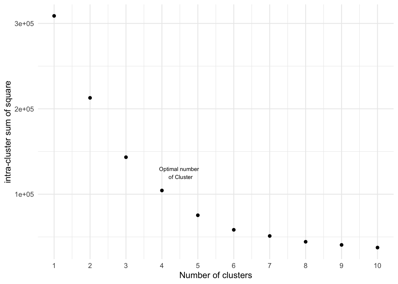
Now we visualize the results of the analysis. The clusters are the then the groups companies could target specifically. For example people with high income, but low spending score.
############ 4 Clusters
k4<-kmeans(mall_data[,3:5],4,iter.max=1000,nstart=50,algorithm="Lloyd")
k4
## K-means clustering with 4 clusters of sizes 95, 28, 39, 38
##
## Cluster means:
## Age Annual_Income_dollar_k Spending_Score
## 1 44.89474 48.70526 42.63158
## 2 24.82143 28.71429 74.25000
## 3 32.69231 86.53846 82.12821
## 4 40.39474 87.00000 18.63158
##
## Clustering vector:
## [1] 2 2 1 2 1 2 1 2 1 2 1 2 1 2 1 2 1 2 1 2 1 2 1 2 1 2 1 2 1 2 1 2 1 2 1 2 1
## [38] 2 1 2 1 2 1 2 1 2 1 1 1 1 1 2 1 1 1 1 1 1 1 1 1 2 1 1 1 2 1 1 2 1 1 1 1 1
## [75] 1 1 1 1 1 1 1 1 1 1 1 1 1 1 1 1 1 1 1 1 1 1 1 1 1 1 1 1 1 1 1 1 1 1 1 1 1
## [112] 1 1 1 1 1 1 1 1 1 1 1 1 3 4 3 4 3 4 3 4 3 4 3 4 3 4 3 4 3 4 3 4 3 4 3 4 3
## [149] 4 3 4 3 4 3 4 3 4 3 4 3 4 3 4 3 4 3 4 3 4 3 4 3 4 3 4 3 4 3 4 3 4 3 4 3 4
## [186] 3 4 3 4 3 4 3 4 3 4 3 4 3 4 3
##
## Within cluster sum of squares by cluster:
## [1] 62300.800 9099.071 13972.359 18993.921
## (between_SS / total_SS = 66.2 %)
##
## Available components:
##
## [1] "cluster" "centers" "totss" "withinss" "tot.withinss"
## [6] "betweenss" "size" "iter" "ifault"pc_clust=prcomp(mall_data[,3:5],scale=FALSE)
summary(pc_clust)## Importance of components:
## PC1 PC2 PC3
## Standard deviation 26.4625 26.1597 12.9317
## Proportion of Variance 0.4512 0.4410 0.1078
## Cumulative Proportion 0.4512 0.8922 1.0000pc_clust$rotation[,1:2] ## PC1 PC2
## Age 0.1889742 -0.1309652
## Annual_Income_dollar_k -0.5886410 -0.8083757
## Spending_Score -0.7859965 0.5739136set.seed(123)
ggplot(mall_data, aes(x= Annual_Income_dollar_k, y= Spending_Score, colour= factor(k4$cluster)))+
geom_point(stat = "identity")+
scale_color_discrete(name= " ", breaks= c("1","2","3","4"),
labels =c("Cluster 1","Cluster 2","Cluster 3","Cluster 4"))+
labs(x= "Spending Score", y= "Annual income in 1000 US $")+
ggtitle("Segments of Mall Customers", subtitle= "K-means Clustering")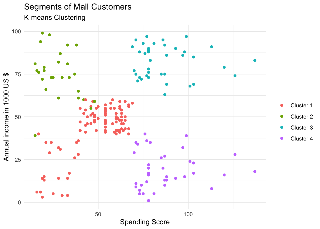
clusplot(mall_data,
k4$cluster,
lines=0,
shade=TRUE,
color= TRUE,
labels=5,
plotchar=TRUE,
span=FALSE,
main=paste("Segments of Mall Customers"),
sub= paste("K-means Clustering"),
xlab="annual incomes",
ylab="spending score")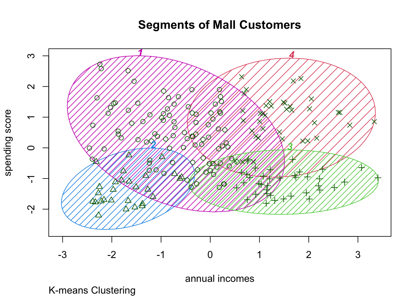 As you might see the best cluster size is probably \(n= 5\). )
############ 5 Clusters
k5<-kmeans(mall_data[,3:5],5,iter.max=1000,nstart=50,algorithm="Lloyd")
k5
## K-means clustering with 5 clusters of sizes 39, 22, 23, 36, 80
##
## Cluster means:
## Age Annual_Income_dollar_k Spending_Score
## 1 32.69231 86.53846 82.12821
## 2 25.27273 25.72727 79.36364
## 3 45.21739 26.30435 20.91304
## 4 40.66667 87.75000 17.58333
## 5 42.93750 55.08750 49.71250
##
## Clustering vector:
## [1] 3 2 3 2 3 2 3 2 3 2 3 2 3 2 3 2 3 2 3 2 3 2 3 2 3 2 3 2 3 2 3 2 3 2 3 2 3
## [38] 2 3 2 3 2 3 5 3 2 5 5 5 5 5 5 5 5 5 5 5 5 5 5 5 5 5 5 5 5 5 5 5 5 5 5 5 5
## [75] 5 5 5 5 5 5 5 5 5 5 5 5 5 5 5 5 5 5 5 5 5 5 5 5 5 5 5 5 5 5 5 5 5 5 5 5 5
## [112] 5 5 5 5 5 5 5 5 5 5 5 5 1 4 1 5 1 4 1 4 1 4 1 4 1 4 1 4 1 4 1 5 1 4 1 4 1
## [149] 4 1 4 1 4 1 4 1 4 1 4 1 4 1 4 1 4 1 4 1 4 1 4 1 4 1 4 1 4 1 4 1 4 1 4 1 4
## [186] 1 4 1 4 1 4 1 4 1 4 1 4 1 4 1
##
## Within cluster sum of squares by cluster:
## [1] 13972.359 4099.818 8948.609 17669.500 30673.462
## (between_SS / total_SS = 75.6 %)
##
## Available components:
##
## [1] "cluster" "centers" "totss" "withinss" "tot.withinss"
## [6] "betweenss" "size" "iter" "ifault"pc_clust=prcomp(mall_data[,3:5],scale=FALSE)
summary(pc_clust)## Importance of components:
## PC1 PC2 PC3
## Standard deviation 26.4625 26.1597 12.9317
## Proportion of Variance 0.4512 0.4410 0.1078
## Cumulative Proportion 0.4512 0.8922 1.0000pc_clust$rotation[,1:2] ## PC1 PC2
## Age 0.1889742 -0.1309652
## Annual_Income_dollar_k -0.5886410 -0.8083757
## Spending_Score -0.7859965 0.5739136set.seed(123)
ggplot(mall_data, aes(x= Annual_Income_dollar_k, y= Spending_Score, colour= factor(k5$cluster)))+
geom_point(stat = "identity")+
scale_color_discrete(name= " ", breaks= c("1","2","3","4","5"),
labels =c("Cluster 1","Cluster 2","Cluster 3","Cluster 4", "Cluster 5"))+
labs(x= "Spending Score (1-100)", y= "Annual income in 1000 US $")+
ggtitle("Segments of Mall Customers", subtitle= "K-means Clustering")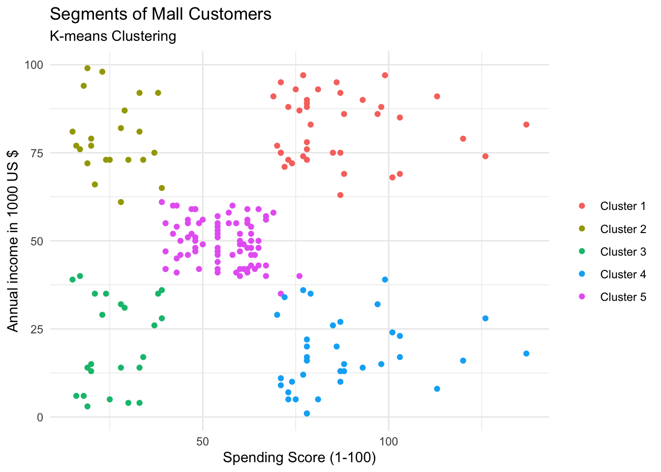
clusplot(mall_data,
         k5$cluster,
         lines=0,
         shade=TRUE,
         color= TRUE,
         labels=5,
         plotchar=TRUE,
         span=FALSE,
         main=paste("Segments of Mall Customers"),
         sub= paste("K-means Clustering"),
         xlab="annual incomes",
         ylab="spending score")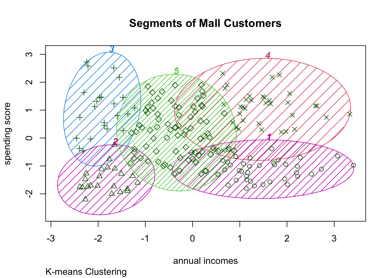
############ 6 Clusters
k6<-kmeans(mall_data[,3:5],6,iter.max=1000,nstart=50,algorithm="Lloyd")
k6
## K-means clustering with 6 clusters of sizes 45, 21, 35, 39, 38, 22
##
## Cluster means:
## Age Annual_Income_dollar_k Spending_Score
## 1 56.15556 53.37778 49.08889
## 2 44.14286 25.14286 19.52381
## 3 41.68571 88.22857 17.28571
## 4 32.69231 86.53846 82.12821
## 5 27.00000 56.65789 49.13158
## 6 25.27273 25.72727 79.36364
##
## Clustering vector:
## [1] 2 6 2 6 2 6 2 6 2 6 2 6 2 6 2 6 2 6 2 6 2 6 2 6 2 6 2 6 2 6 2 6 2 6 2 6 2
## [38] 6 2 6 1 6 1 5 2 6 1 5 5 5 1 5 5 1 1 1 1 1 5 1 1 5 1 1 1 5 1 1 5 5 1 1 1 1
## [75] 1 5 1 5 5 1 1 5 1 1 5 1 1 5 5 1 1 5 1 5 5 5 1 5 1 5 5 1 1 5 1 5 1 1 1 1 1
## [112] 5 5 5 5 5 1 1 1 1 5 5 5 4 5 4 3 4 3 4 3 4 5 4 3 4 3 4 3 4 3 4 5 4 3 4 3 4
## [149] 3 4 3 4 3 4 3 4 3 4 3 4 3 4 3 4 3 4 3 4 3 4 3 4 3 4 3 4 3 4 3 4 3 4 3 4 3
## [186] 4 3 4 3 4 3 4 3 4 3 4 3 4 3 4
##
## Within cluster sum of squares by cluster:
## [1] 8062.133 7732.381 16690.857 13972.359 7742.895 4099.818
## (between_SS / total_SS = 81.1 %)
##
## Available components:
##
## [1] "cluster" "centers" "totss" "withinss" "tot.withinss"
## [6] "betweenss" "size" "iter" "ifault"pc_clust=prcomp(mall_data[,3:5],scale=FALSE)
summary(pc_clust)## Importance of components:
## PC1 PC2 PC3
## Standard deviation 26.4625 26.1597 12.9317
## Proportion of Variance 0.4512 0.4410 0.1078
## Cumulative Proportion 0.4512 0.8922 1.0000pc_clust$rotation[,1:2] ## PC1 PC2
## Age 0.1889742 -0.1309652
## Annual_Income_dollar_k -0.5886410 -0.8083757
## Spending_Score -0.7859965 0.5739136set.seed(123)
ggplot(mall_data, aes(x= Annual_Income_dollar_k, y= Spending_Score, colour= factor(k6$cluster)))+
geom_point(stat = "identity")+
scale_color_discrete(name= " ", breaks= c("1","2","3","4","5","6"),
labels =c("Cluster 1","Cluster 2","Cluster 3","Cluster 4", "Cluster 5", "Cluster 6"))+
labs(x= "Spending Score (1-100)", y= "Annual income in 1000 US $")+
ggtitle("Segments of Mall Customers", subtitle= "K-means Clustering")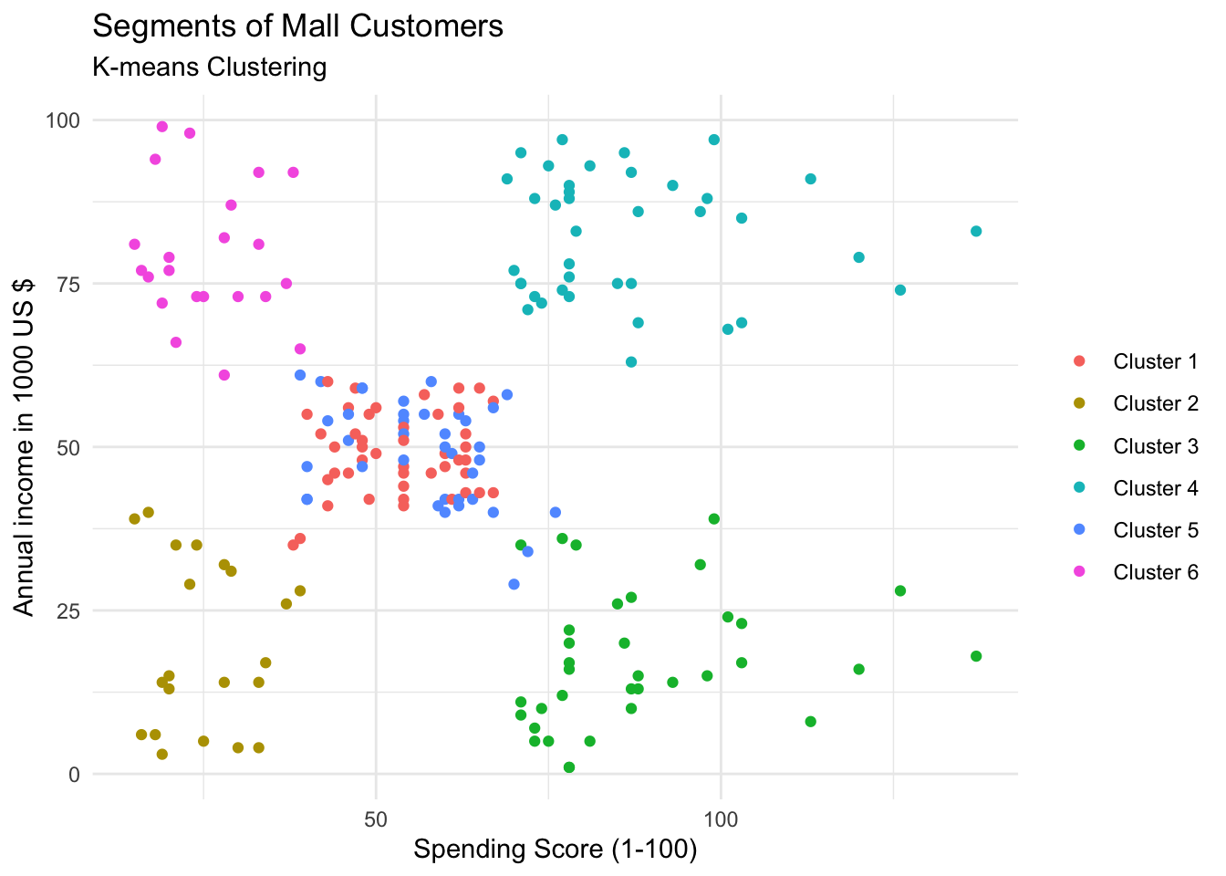
clusplot(mall_data,
         k6$cluster,
         lines=0,
         shade=TRUE,
         color= TRUE,
         labels=5,
         plotchar=TRUE,
         span=FALSE,
         main=paste("Segments of Mall Customers"),
         sub= paste("K-means Clustering"),
         xlab="annual incomes",
         ylab="spending score")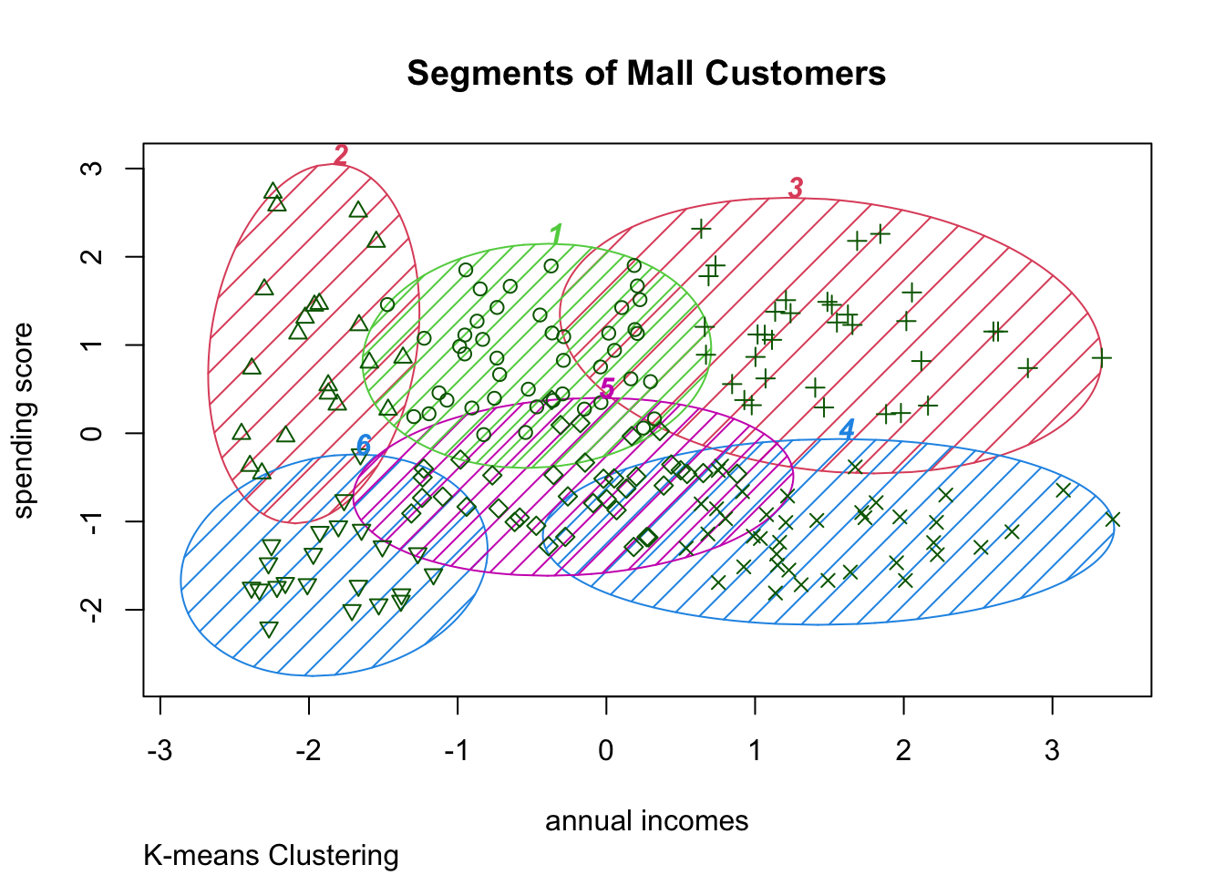
Thoughts
This was a fun analysis and a really good exercise for practicing the K-means-algortihm workflow.